Android O hidden features: The big and small changes for regular users
There's more to Android O than the big new developer features Google's talking about publicly.
Any new Android release is a big deal. And new developer preview build, as landed recently for Android O, inevitably has fans scrambling to find new features lurking just below the surface. In addition to big sweeping changes affecting the people who make Android apps, there are dozens of smaller updates and additions waiting to be discovered.
We've rounded up some of the more interesting additions to Android O that may be coming to your device when the update lands. Let's take a look!
First, a recap of the big new developer features
Jerry has a great roundup of all the major Android O additions you need to know about — from notification channels to background app restrictions and font changes — so go take a look!
With that out of the way...
New Settings app

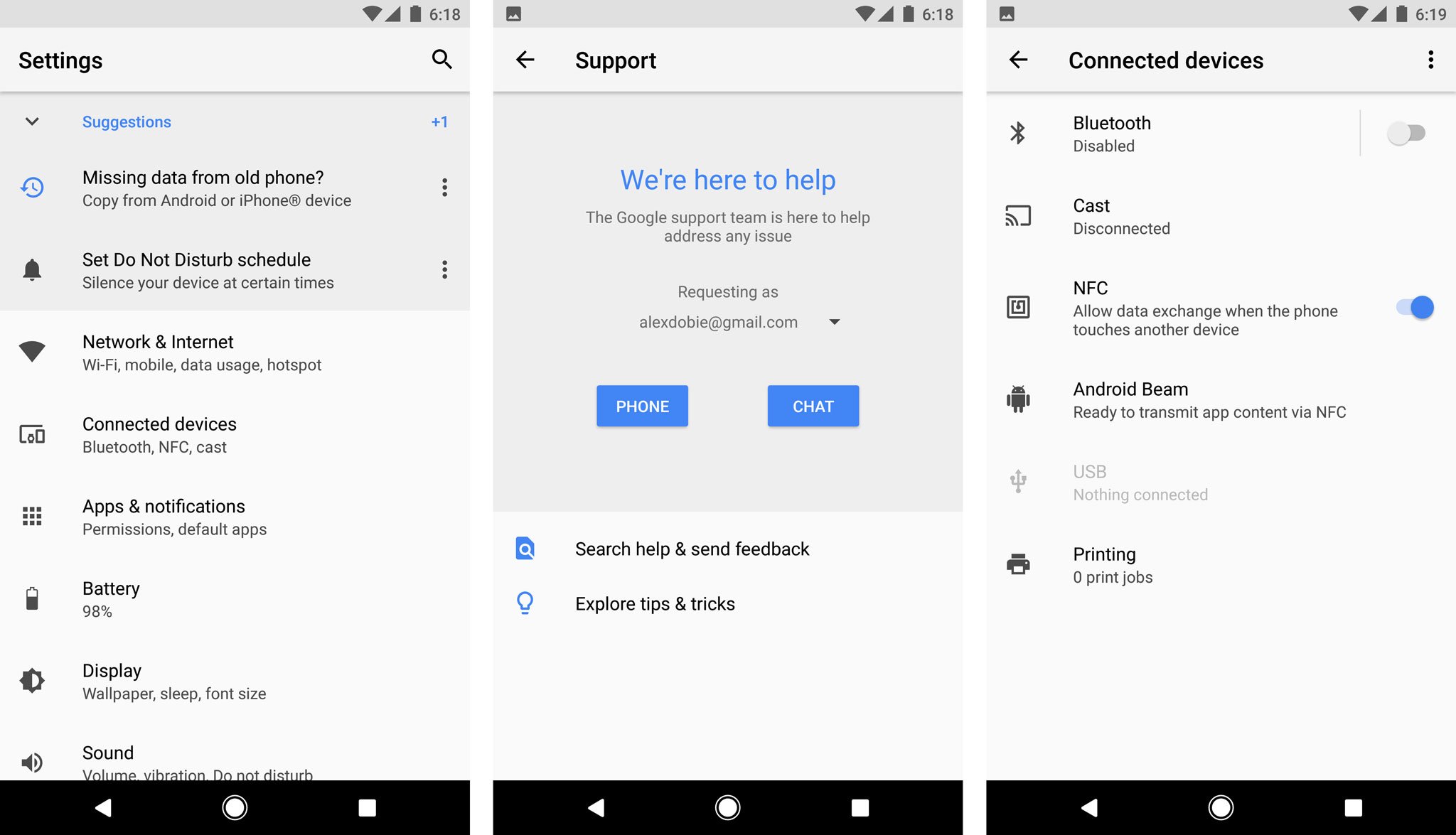
Android's Settings app has been completely overhauled in the O preview. In addition to a fresh white coat of paint, the slide-out navigation area from Nougat is gone, and a number of settings options have been completely relocated.
Notably, the "Support" section, which lived in its own tab on Pixel and Nexus devices before, has been offloaded into its own top-level settings area. And settings toggles like NFC, Cast and Android Beam are more discoverable, living in the new "Connected Devices" area.

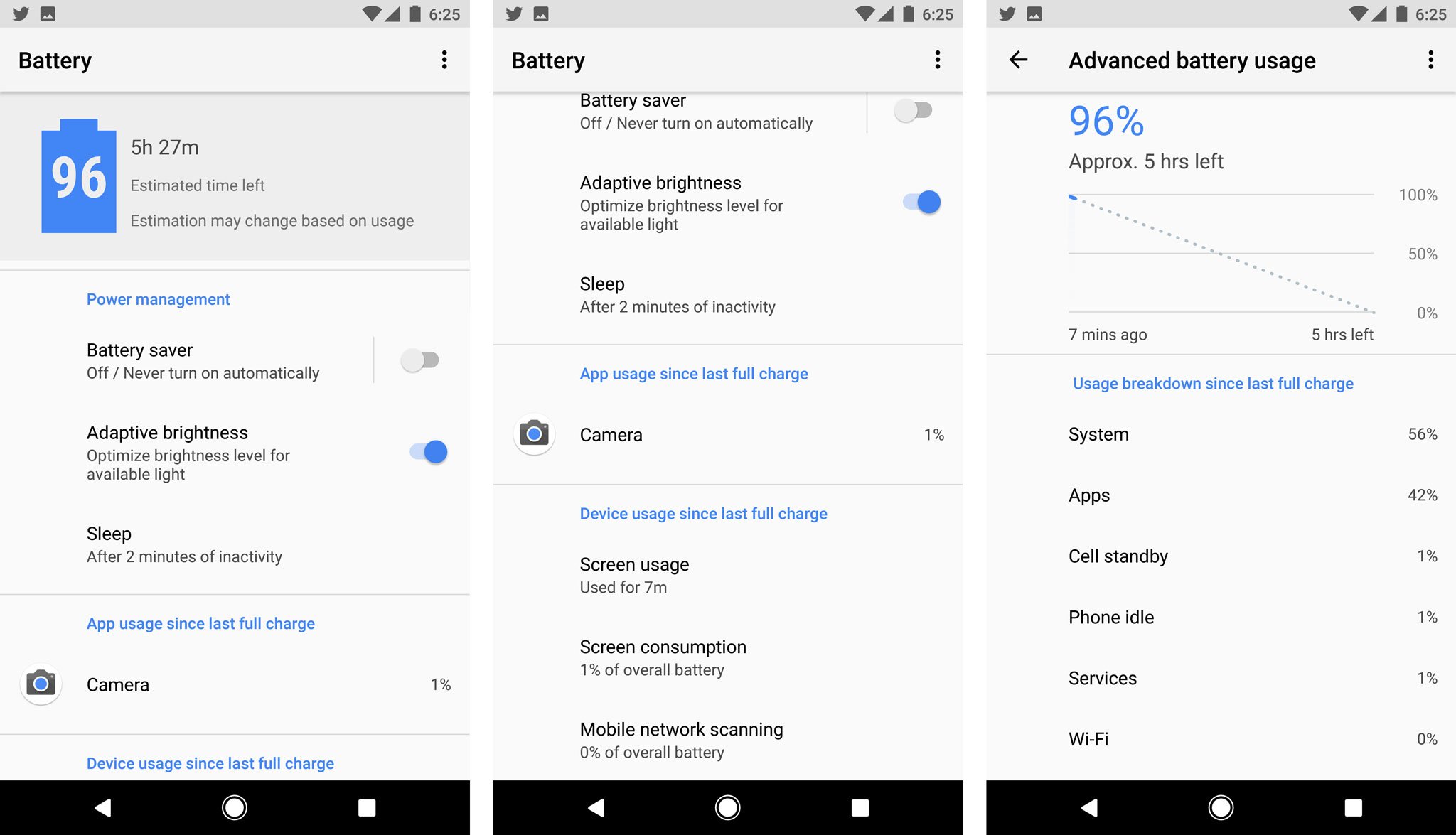
The Battery settings page has been significantly redesigned as well, with a top-level estimate of your remaining time left, and screen-on time surfaced right on this page, below app power usage. The Advanced Battery Usage page shows less detail than before, though. Wake/sleep information is omitted, with the line graph only showing your past and estimated future battery consumption.
Home screen icon badges

Another setting supported on a per-app basis by some phone makers, numbered badges are supported natively in Android O, and can be toggled on a per-app basis in the notification settings.
Since no apps out in the wild are currently targeting O, this one's hard to show off. Expect a little numbered circle next to the app icon when apps start to roll out support.
Ambient Display becomes less complicated

Android's Ambient Display feature has been largely unchanged for the past couple of releases, but it's getting a big overhaul in O. By default, only app icons are shown alongside the system time, like Samsung's Always-On Display feature.
Android O's Ambient Display changes are sure to be divisive.
When a new notification arrives, it pulses the lock screen in an enlarged form — which doesn't mirror Android's lock screen layout directly, but is more glanceable than the old setup when it pulses on screen.
The new system may be less complex, but the icon-centric approach shows you less of your current notifications, and right now you'll only see detailed notification info when it first pulses the screen. After that, you'll just see an icon representing each app with notifications waiting.
The new approach also makes it less easy to mess up your notifications on the Google Pixel just by taking the phone out of your pocket. Even with raise-to-wake enabled, you'll need to double-tap the screen or use the fingerprint scanner to get to past the Ambient Display.
Notification changes

The biggest change to notifications in Android O is notification channels, allowing you greater control over the types of notifications you receive from each app — for instance, you could filter by alerts by topic for a news app, or change how you're alerted to social updates from specific groups.
Android O also adds the ability to snooze notifications — the current options are 15, 30 and 60 minutes — which is a convenient option for dismissing alerts for the moment without the risk of forgetting about them later.
And apps with persistent notifications can now be minimized down to a super-slim notification card, freeing up space in the notification shade.
SystemUI Tuner
The SystemUI Tuner — enabled by long-pressing on the cog icon in the notification shade — has grown a bunch of wacky new features in Android O. One popular feature from N and M has been eliminated in the O preview: there's no longer an option to add a tiny percentage readout to your battery icon. But fear not, you can enable a separate battery readout in the status bar customization area.

On the lock screen, SystemUI Tuner lets you customize the two shortcut icons on the left and right sides of the screen (camera and voice search, by default). Options appear to include any activity in an installed app that has its own app shortcut. (That's the feature introduced in Android 7.1 that lets you jump straight to specific areas of an app by long-pressing its icon on the home screen.)
Android's navigation bar can now be tweaked through the SystemUI Tuner too. The back, home and recents keys can be bunched up in the middle (compact) or aligned to the left or right — useful for larger devices. And there's the option to add additional keys on the left and right edges as well, with options including clipboard controls and a keyboard switcher.

You can also assign any unicode character to the shortcut key, and change the icon that appears over it.
You'll find all this stuff under System > SystemUI Tuner once you enable it. As is the case with all features in this article — but especially the SystemUI Tuner — Google may well change or remove these features in future developer previews, so enjoy them while they're here.
'External sources' is now an app-level permission

In earlier Android versions, you'd allow third-party APK files to be installed via one master switch under security settings. In Android O, that's handled as an app-specific permission, and you'll see a prompt telling you an app doesn't have this permission the first time you try to install an APK via, for example, Gmail or the built-in Files app.
To allow an app to install other apps, go to Settings > Apps & notifications > Special access > Install other apps, then toggle the app you want to use to install.
Themes, kinda

The technical underpinnings of theme support have been a part of Android for years, and most big-name phone makers now offer some form of device theming. Now it appears we could see the feature enabled in Google's Pixel devices
Under Settings > Display > Advanced, there's a "Device theme" option, with the current options being "Pixel" and "Inverted." Changing themes requires a device restart right now, and the "Inverted" theme just seems to change the color of the notification shade at present.
It's still early days, and Google has played around with a "dark mode" back in the Marshmallow dev. preview days before dropping the feature, so there's no guarantee this will make the cut.
Work in progress
All of this stuff is subject to change as Google finalizes Android O over the course of the next few months. We're still dealing with an early developer preview here, so none of the features you see on this list are set in stone. And Google itself says more features will be added over the course of the next three developer previews.
We'll be watching with interest to see what makes the cut in future Android O builds. Stay tuned to find out!
Source: Android Central


No comments